When colour steps back, design emerges
The selection of Cloud Dancer as Pantone Color of the Year 2026 brings white back to the centre of design. Yet in kitchen design, white is neither a trend nor a neutral choice.
At Key Cucine, white removes the effect of colour and puts the project to the test. Without chromatic emphasis, only what truly matters remains visible: volumes, proportions, materials, and the relationships between surfaces.
For this reason, white is never a standard finish, but a designed material. Mineral surfaces, stones and marbles shape kitchens in which the design emerges with clarity.
White as volume
In an entirely white kitchen, such as this version of Haiku, depth cannot rely on colour. Here it is generated by the relationship between Calce del Brenta and Emotion Gray marble: a continuous volume, interrupted only as much as necessary to remain legible.
The slim countertop does not become an element in itself, but a line that preserves the idea of a monolithic form. Rounded corners, the horizontal handle cut and uniform modules create an essential rhythm, conceived also for outdoor use.
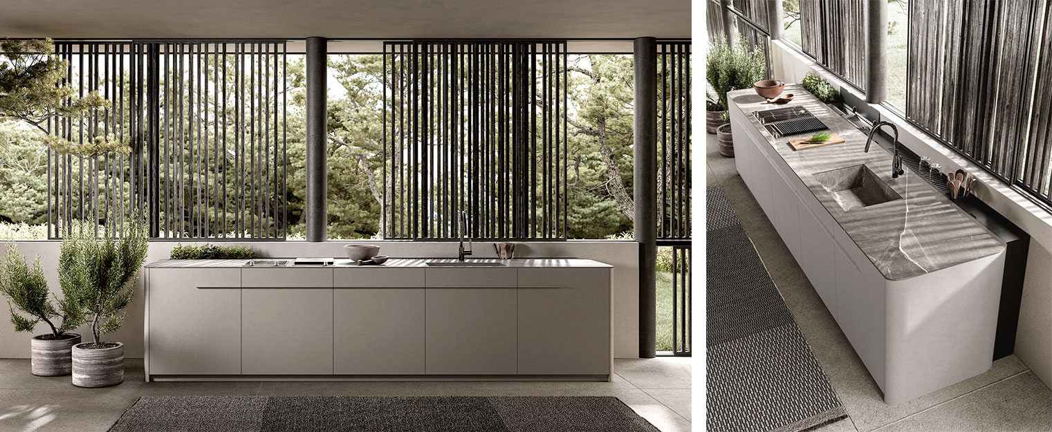
Structure in Calce del Brenta – Countertop in Emotion Gray marble
White as relationship
In this version of Tai_O, white does not build a monolith but creates a dialogue between different materials. The island in Clauzetto marble — countertop and fronts in the same material — makes marble a structural element of the project, rather than a simple cladding.
The rounded edges of the countertop and the integrated sink introduce softness, while the Fossil Oak tall units, precious in both material and craftsmanship, interrupt the white and strengthen its perception.
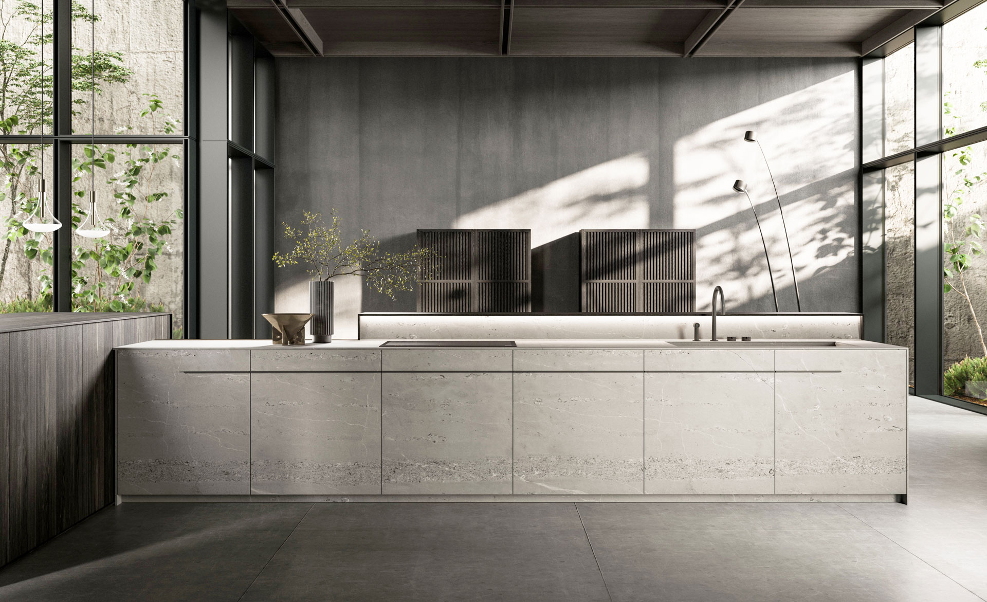
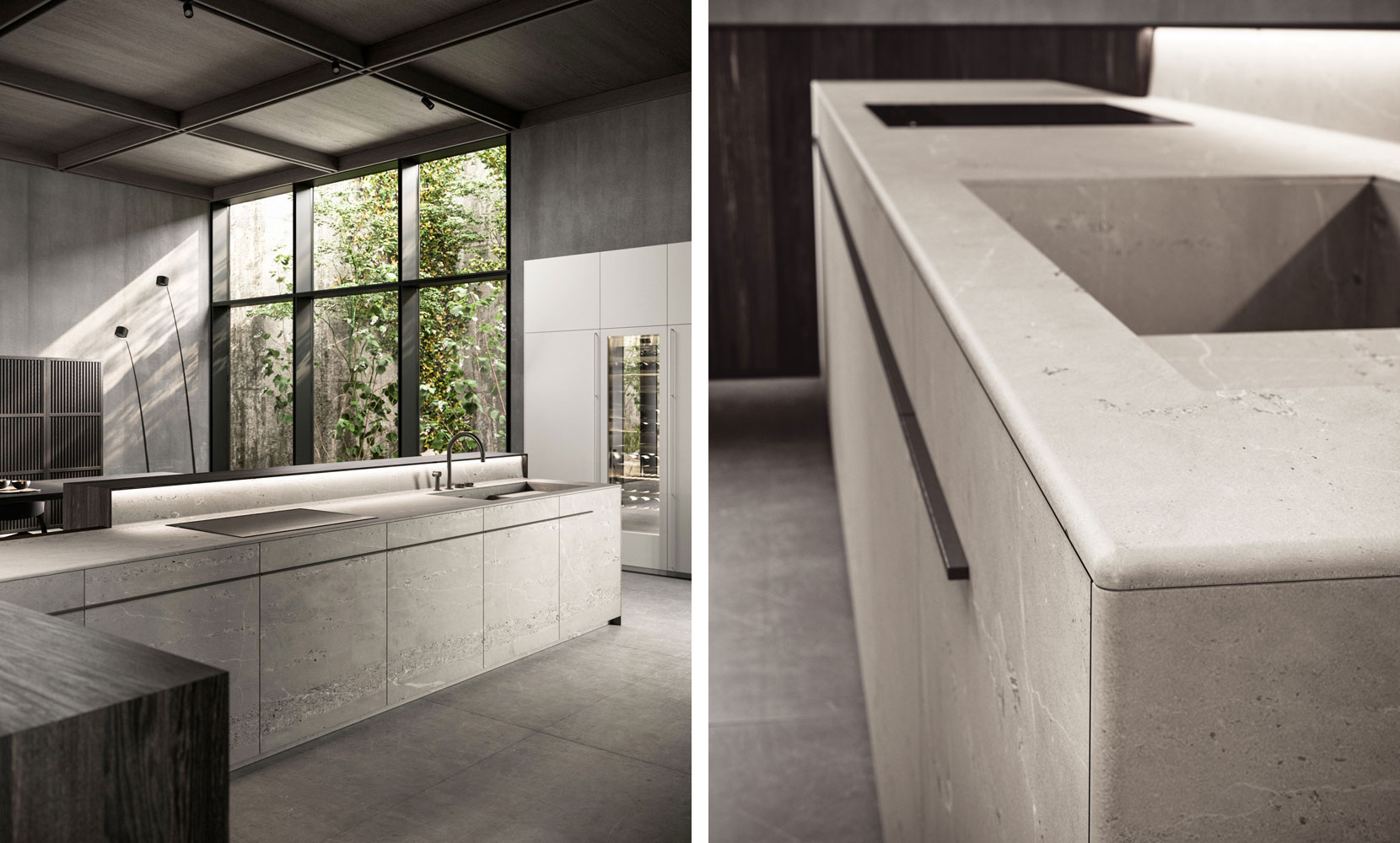
Rovere Terra (millennial oak) – Countertops and fronts in Clauzetto marble
White as rhythm
In the Twins project, white is lacquered, yet the design avoids any neutral or repetitive effect. The tight rhythm of base units and tall cabinets creates a precise sequence, giving movement to the composition without resorting to colour.
The countertop is reduced to an almost invisible presence: its thickness disappears from the frontal view, allowing volumes to define the design. The dialogue with a warm-toned wood introduces contrast and depth, assuming a design role equal to that of white, while remaining quantitatively measured.
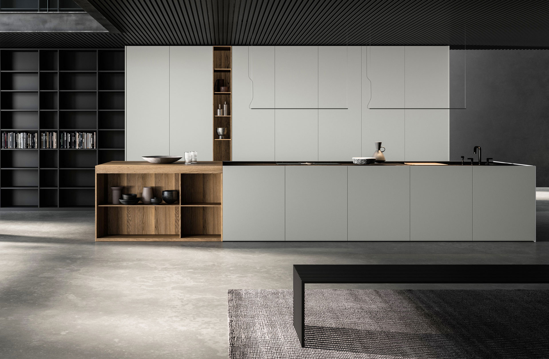
Open units in Fossil Oak – Nero Marquinia porcelain stoneware countertop – White lacquered fronts
White as design
In this kitchen, white is not entrusted to a smooth surface but to the design of the Cuvée door. A worked profile that introduces depth and shadow, without recalling a classical language.
The pairing with a metallic surface shifts the balance towards a contemporary interpretation: white remains central, yet is redefined through a design detail that makes the overall composition current, elegant and unconventional.
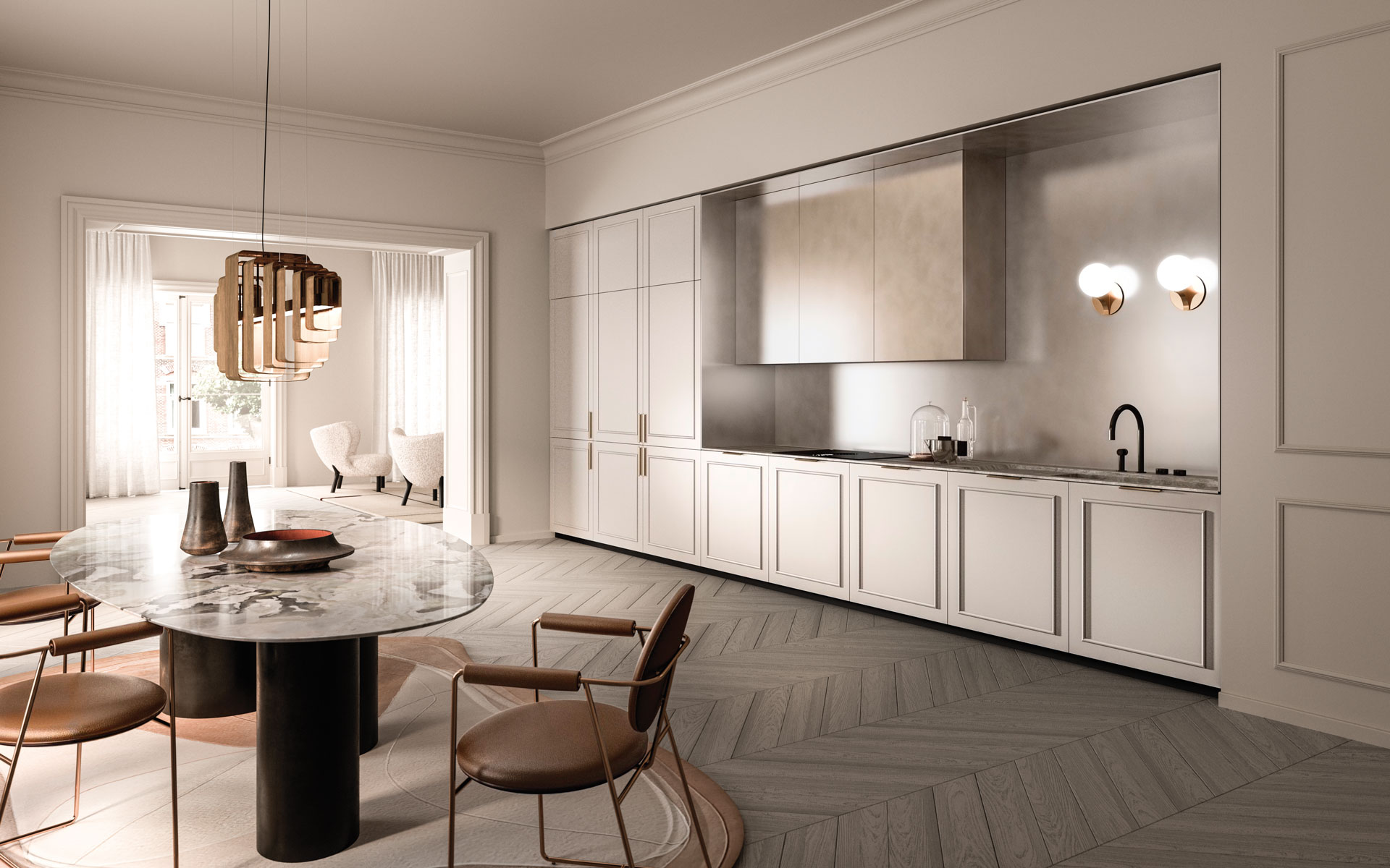 Silver metal finish backsplash – Travertine marble countertop – White lacquered fronts
White as background
In this project featuring the Factory model, white steps back to leave space for composition. The island alternates solids and voids: Travertine marble forms a carved mass, while Gold Oak with a slim framed door introduces depth and detail.
The recessed white tall units define the setting without imposing themselves. Apparently neutral, they reveal a wooden interior when opened, in continuity with the island. White does not guide the eye, but organises space and connects materials.
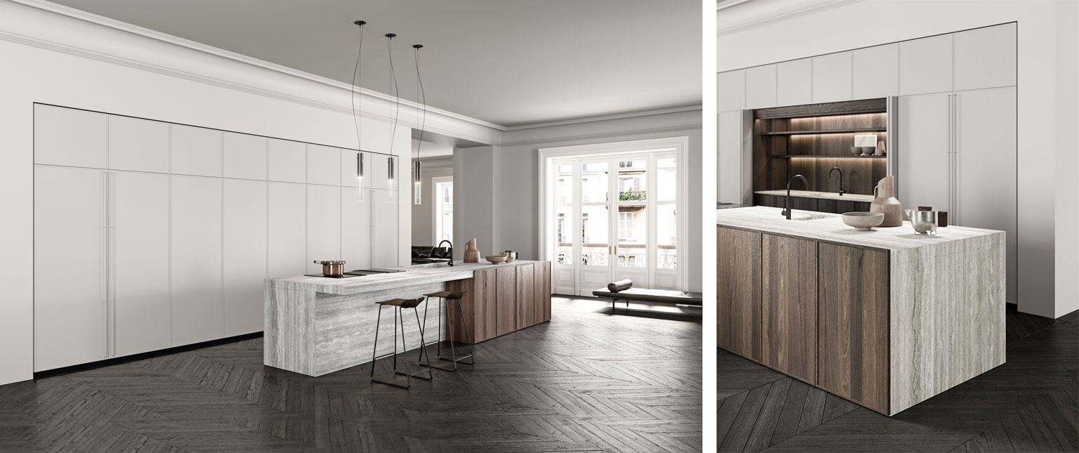 Island countertop in Travertine marble – Framed door in Gold Oak wood – Matte lacquered tall units
In these projects, white is never a colour used to fill.
It is a design space that tests form, material and proportion.
Without the effect of colour, every choice becomes visible and each kitchen tells its own balance. When colour steps back, what remains is not a style to recognise, but a project to understand.


